Redesigning supplier onboarding for a supply chain finance provider.
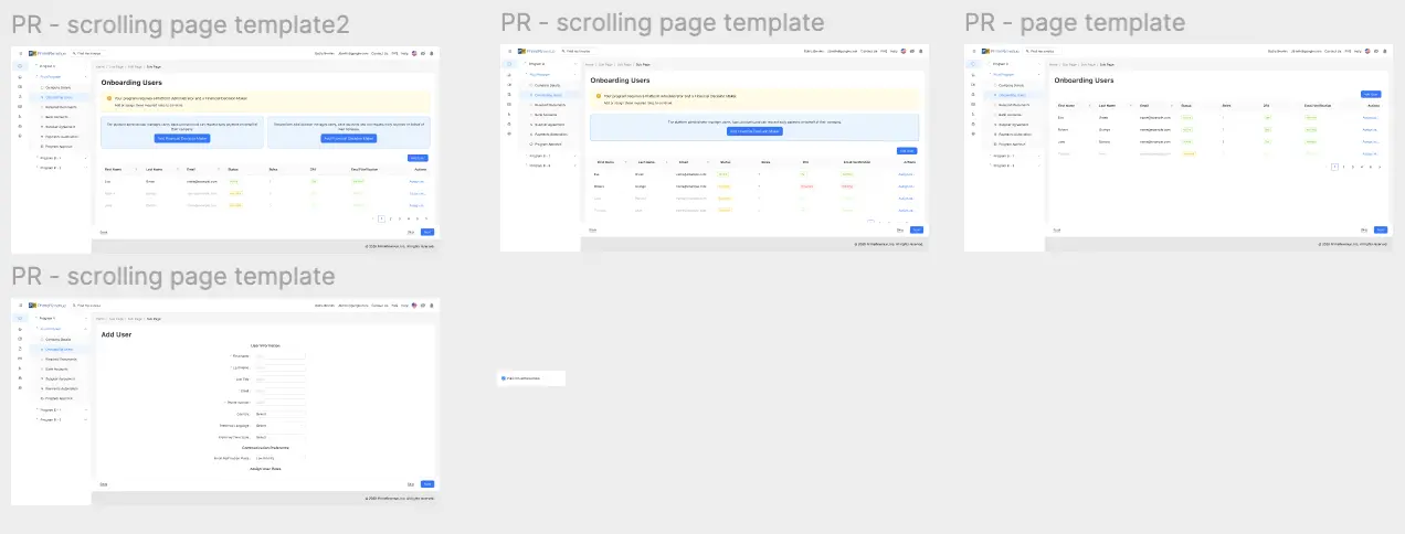
As a Product Design Intern at PrimeRevenue, I worked on supplier onboarding, one of the platform's most critical workflows, for a global enterprise fintech product used by finance teams across supply chains. Over the course of the internship I designed and prototyped 35 handoff-ready screens across three UI libraries, covering everything from full-page layouts to modals, and migrated and redesigned a set of legacy screens that had originally been built in Adobe XD into Figma using PrimeRevenue Design System 2.0, contributing new UI components back into the system to keep the experience consistent across workflows.
Design decisions were shaped through close collaboration with Product, Engineering, QA, and Design teams to make sure every solution was both technically feasible and met the bar for client experience, alongside research into competitor platforms and industry design patterns that informed how the onboarding flow should look, feel, and behave.
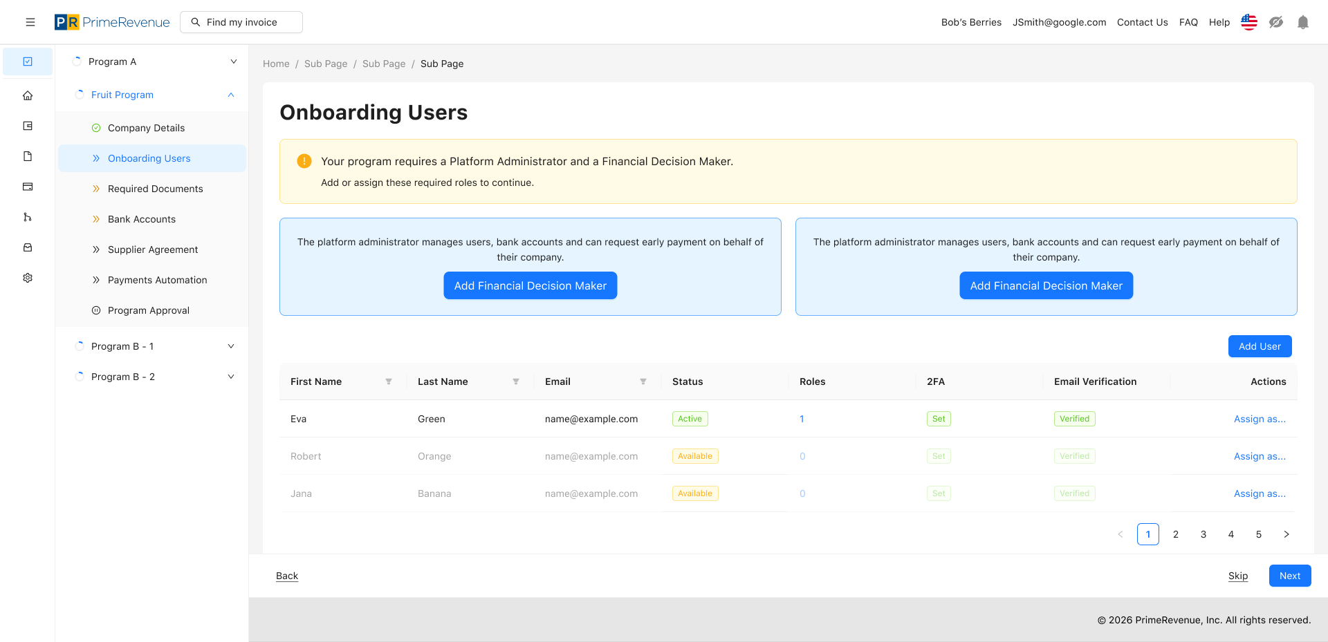
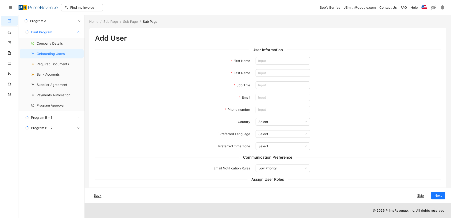
Before any of the onboarding screens could be rebuilt, I had to fully understand how the existing Adobe XD screens actually worked. That meant going through every flow by hand — testing each state, edge case, and interaction — to map out the underlying functionality that the original files didn't fully document, since a lot of that logic was never written down anywhere.
Once I understood what each screen needed to do, I cross-referenced it against PrimeRevenue Design System 2.0, which was built on top of Flowbite. For flows the system already covered, I rebuilt the screens using existing components to keep things consistent. But several specific items like tables and cards didn't have a themed match in the library yet, so new components had to be designed from scratch and contributed back into the system for other teams to reuse.
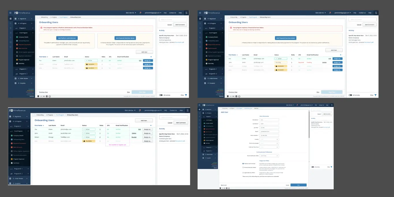
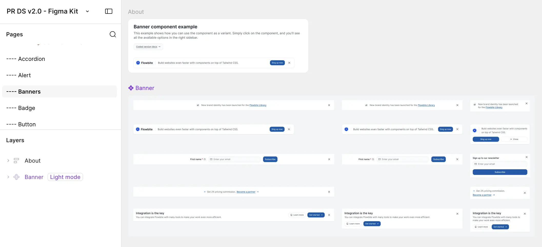
Using PrimeRevenue Design System 2.0, I designed and prototyped two full user flows for the onboarding experience, taking each one from early concepts through developer-ready handoff. Both flows were fully built out and signed off as ready for development.
Partway through the project, Product Managers and Engineering decided to move off Flowbite as the underlying UI library, since it didn't have strong enough React support for what the team needed. I spent time experimenting with two alternatives, Material UI and Ant Design, evaluating each against the existing onboarding patterns, and presented my findings to Developers, QA, Product, and Design. That research ultimately helped inform the team's decision to move forward with Material UI.
With the new library selected, the two flows I'd already handed off couldn't just carry over — Material UI didn't have equivalents for several of the components the onboarding experience depended on. Before I could rebuild the screens themselves, I had to design and build out those missing components in Material UI first, effectively re-establishing a working component library before returning to full-screen design.
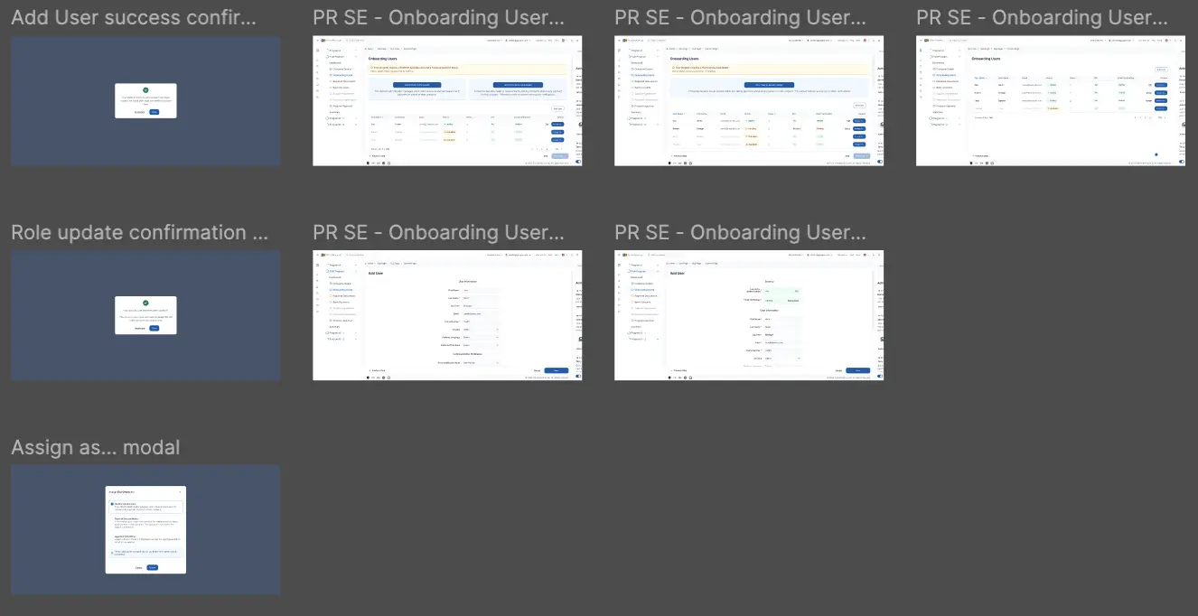
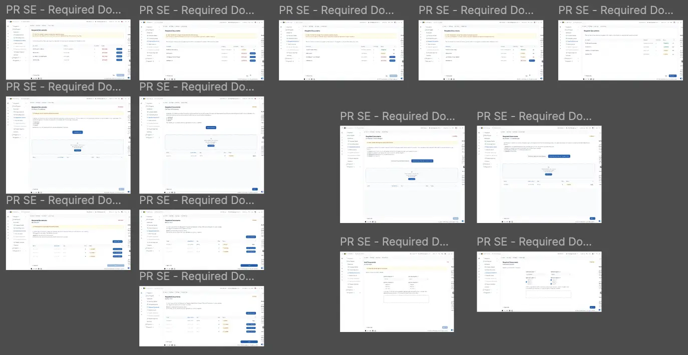
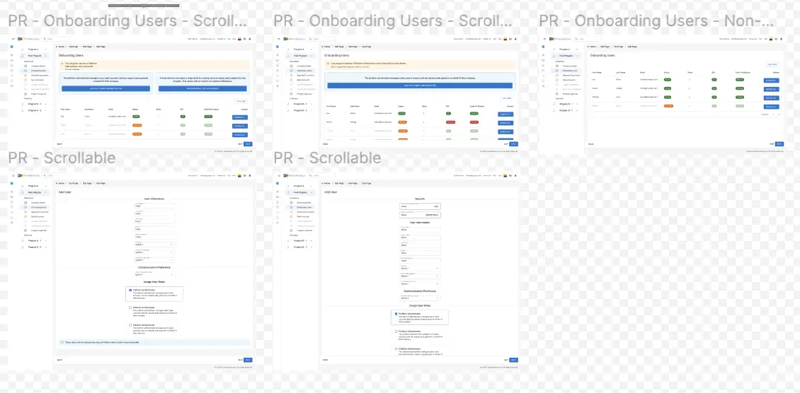
This internship taught me that most of design work in a real product environment isn't just about pixels — it's about staying flexible when the constraints shift underneath you. Losing the Flowbite library partway through meant redoing groundwork I'd already finished, but it also gave me a much better sense of how to evaluate a UI library systemically instead of just visually, and how to bring that evaluation to a cross-functional team in a way that actually moved a decision forward.
By the end of the internship, I'd designed 35 handoff-ready screens and modals across three different UI libraries, contributed new components to two design systems, and worked closely enough with Engineering and QA that handoff stopped feeling like a handoff and started feeling like an extension of the same conversation. It reinforced how much of good product design happens in collaboration with the people building and testing it, not just in Figma.